

Materially different.
TWENTY2 operates at a unique intersection — creative vision and production expertise. As the business evolved, the brand required greater clarity and focus. The opportunity was not reinvention, but precision.
We partnered with the TWENTY2 team to define the strategic position, strengthen the narrative, and develop a more disciplined visual system supported by a new digital experience.
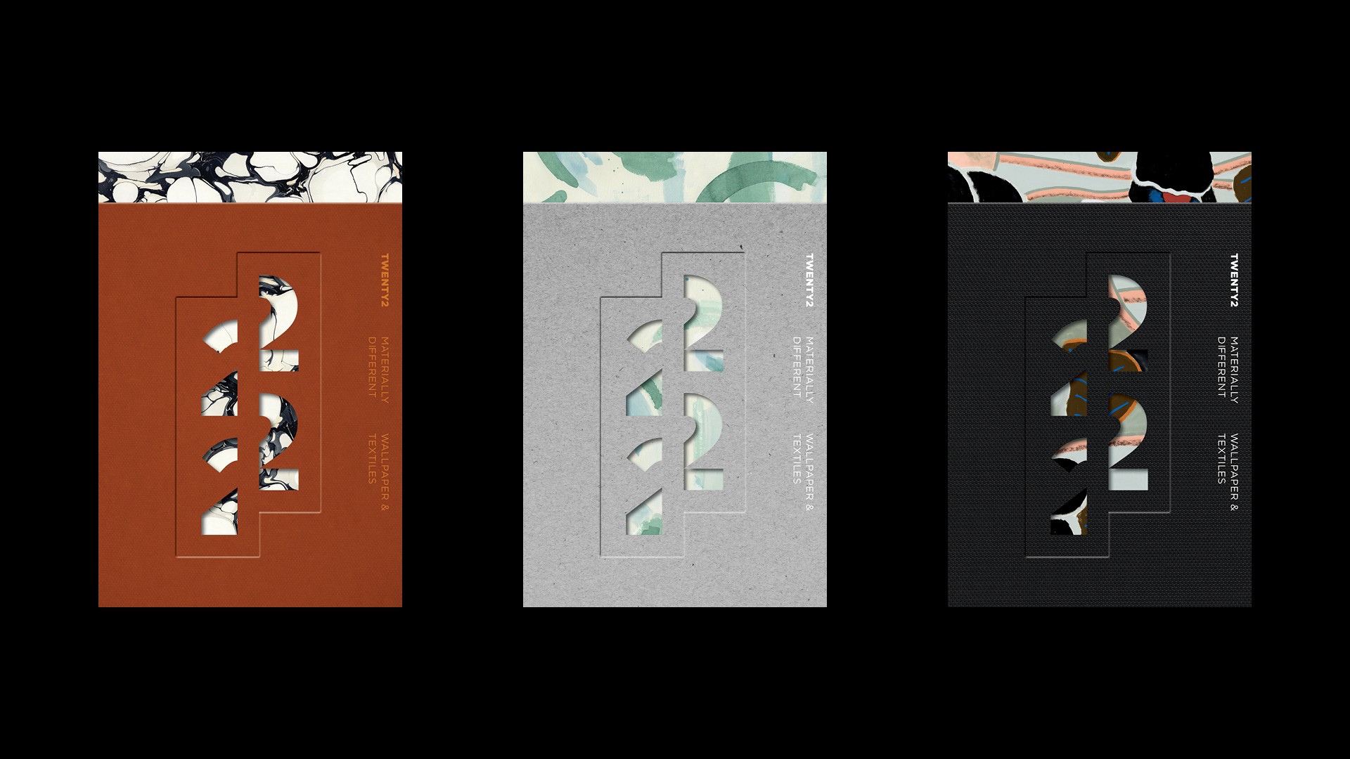
That work produced Materially Different — a line that operates on two levels, referencing both the tangible nature of TWENTY2's work and the distinctiveness of its approach. Precise rather than promotional.
The logo makes the idea physical. A dissected 22, inspired by the act of joining materials at the seam — clean lines, tactile thinking, craft made visible in the mark itself.
The outcome is a brand that feels as intentional as the work it produces.
twenty2.net
Identity created in partnership with Powell Allen Brands.
Wallpaper design credit from left to right:Seastone by Rule of Three Studio, Dreamscape by Rebecca Atwood Designs; Poppies Noir by Wayne Pate & Studio Four NYC.